• The VOIDRUNNER'S CODEX is coming! Explore new worlds, fight oppressive empires, fend off fearsome aliens, and wield deadly psionics with this comprehensive boxed set expansion for 5E and A5E!

D&D (2024) New D&D Edition's Player’s Handbook Cover Reveal

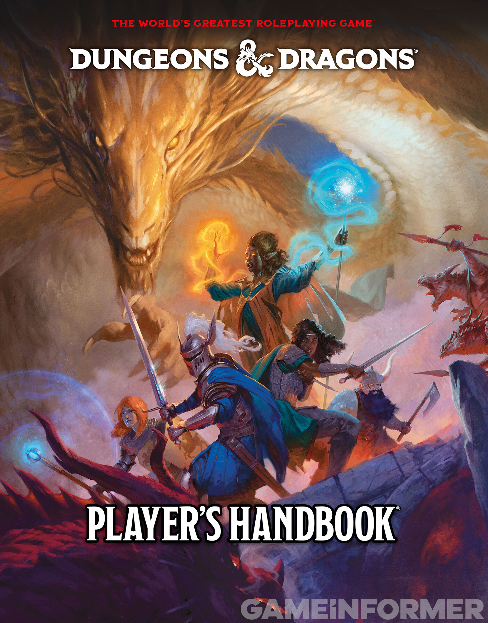
Game Informer has revealed the cover to the 2024 Player’s Handbook.

Game Informer has revealed the cover to the 2024 Player’s Handbook.

The cover features a gold dragon behind the old-school D&D characters Strongheart the paladin, Mercion the cleric, Elkhorn the dwarf fighter, and Molliver the thief. Ringlerun the wizard is absent (then again he got his showcase on one of the 1E AD&D Player's Handbooks), but a drow mage appears to have joined the party!
IMG_3566.jpeg
 

log in or register to remove this ad


log in or register to remove this ad

EzekielRaiden

Follower of the Way
It's not bad. I like it better than some of the other revealed art. Kinda sad there's no dragonborn, even on the back cover, given they've retained their "3rd most popular nonhuman race" status for years at this point.


Autumnal

Bruce Baugh, Writer of Fortune
On the other hand, who remembers the Raiders of the Lost Ark poster, other than the logo type? Things stick or don’t for a combination of cultural context, their design, and the whim of the gods.
 

Vaalingrade

Legend
I'm trying to wrap my head around what wouldn't be considered 'posing' and would still be a good cover for an action fantasy RPG.

- we're not allowed to have an image of characters en media res in a thrilling action scene because posing is bad and wrong.

- we can't have them using any of their abilities to illustrate what the game is about and pique the imagination because posing is bad and wrong.

- we can't have the characters standing shoulder to shoulder because posing is band and wrong.

- we can't have the party relaxing somewhere because the Avengers had a post credit scene where the heroes were sitting around relaxing and marvel is bad and wrong.

- we can't make the books look like actual magic books because... BECAUSE apparently.

So instead of telling us everything that is bad and wrong (because that's EVERYTHING that would fit the game), how about tell us what is allowed to be a D&D cover?


FitzTheRuke

Legend
I think that it's a disservice to the whole piece to have that Red Dragon hiding behind the PHB logo. When you don't notice the Red Dragon, the group is standing around "posing", but if you draw more attention to the dragon, they are DEFENDING (not posing)

Perhaps that Gold Dragon is injured (or pretending to be as a "test") and the Red (and its Kobold Minions) has taken the opportunity to try to kill the Gold. The PCs are protecting the gold from the attack.

It's a clear action shot, and not posing at all, when taken into this context.

With the Red Dragon hidden? It looks like posing.

As far as the overall Dragon design work goes, I feel like there's been a direct progression from the 1e PHB to now (at least for Chromatics, the Metallics have had a course that winds like a Gold Dragon's back!)

They are still, and have (nearly) always followed the basics of the 1e design, they'be just tweaked and added distinctions over the years. The "thicc" part of the latest design I could take or leave, but everything else is looking quite slick.


Remove ads

Remove ads

Top